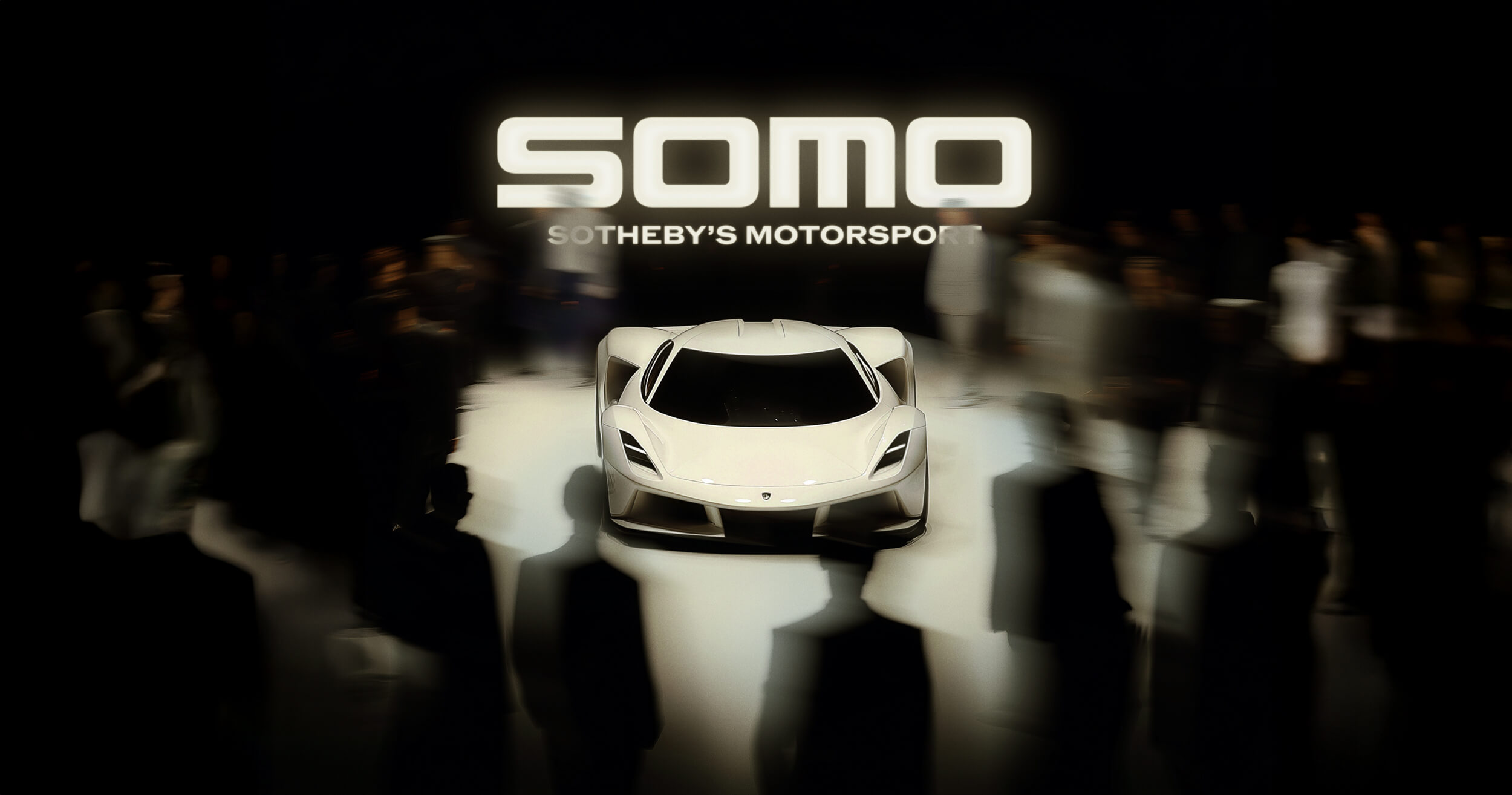
SOMO is reshaping automotive auctions by pairing its industry expertise with a digital platform built for modern collectors, making the experience more transparent and accessible than ever.
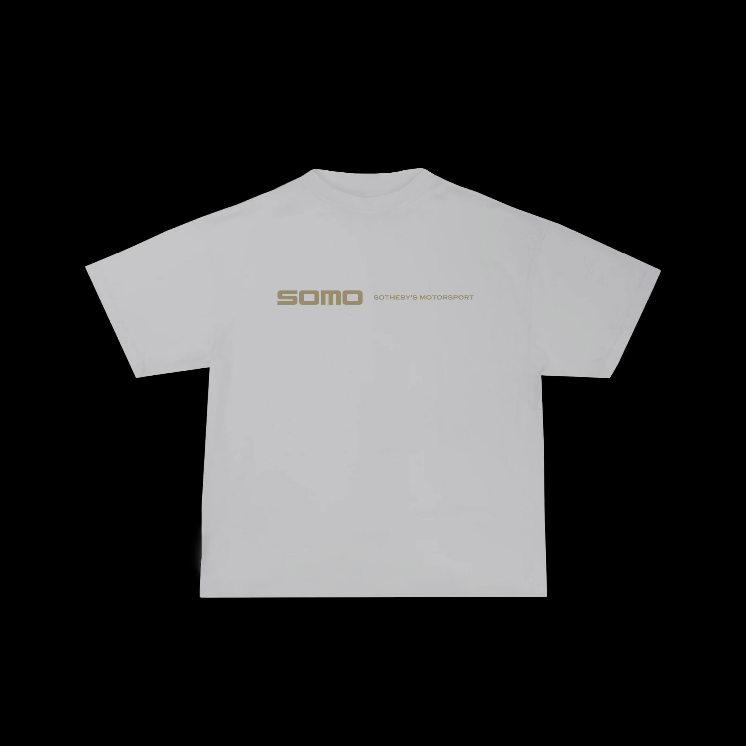
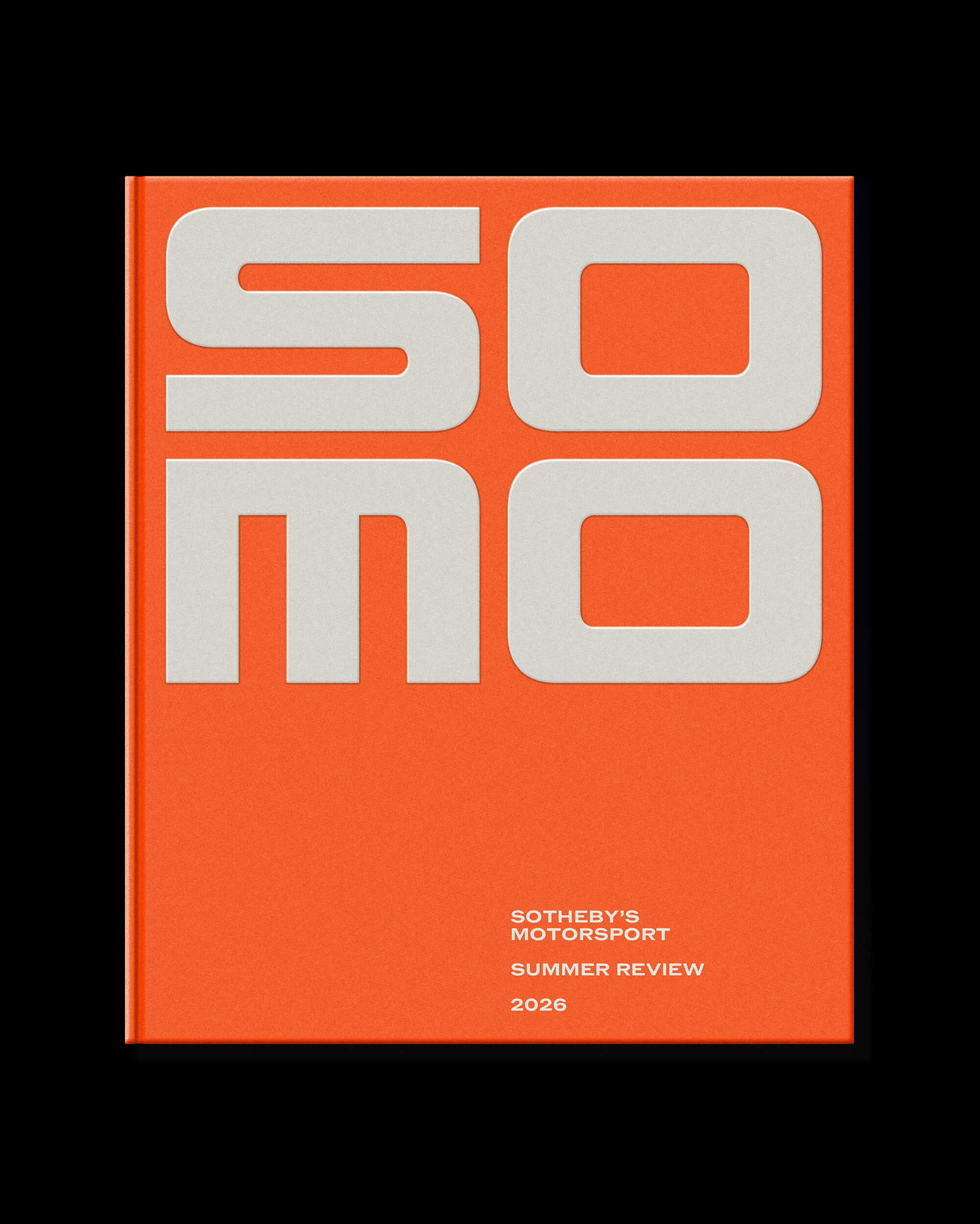
Forth+Back was brought on to refresh SOMO’s identity with a system that feels sleek, modern, and aligned with the platform’s forward-thinking approach.
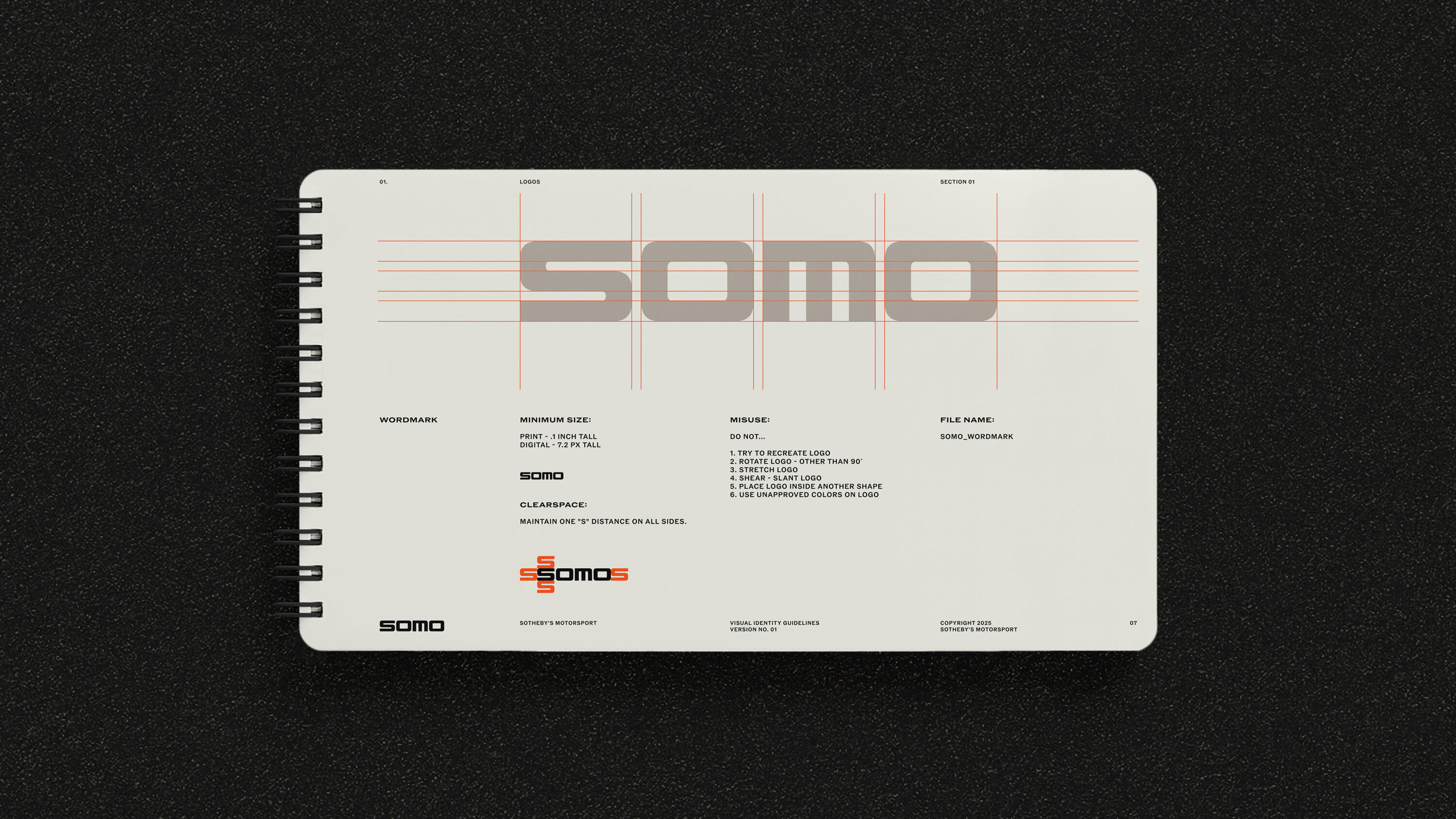
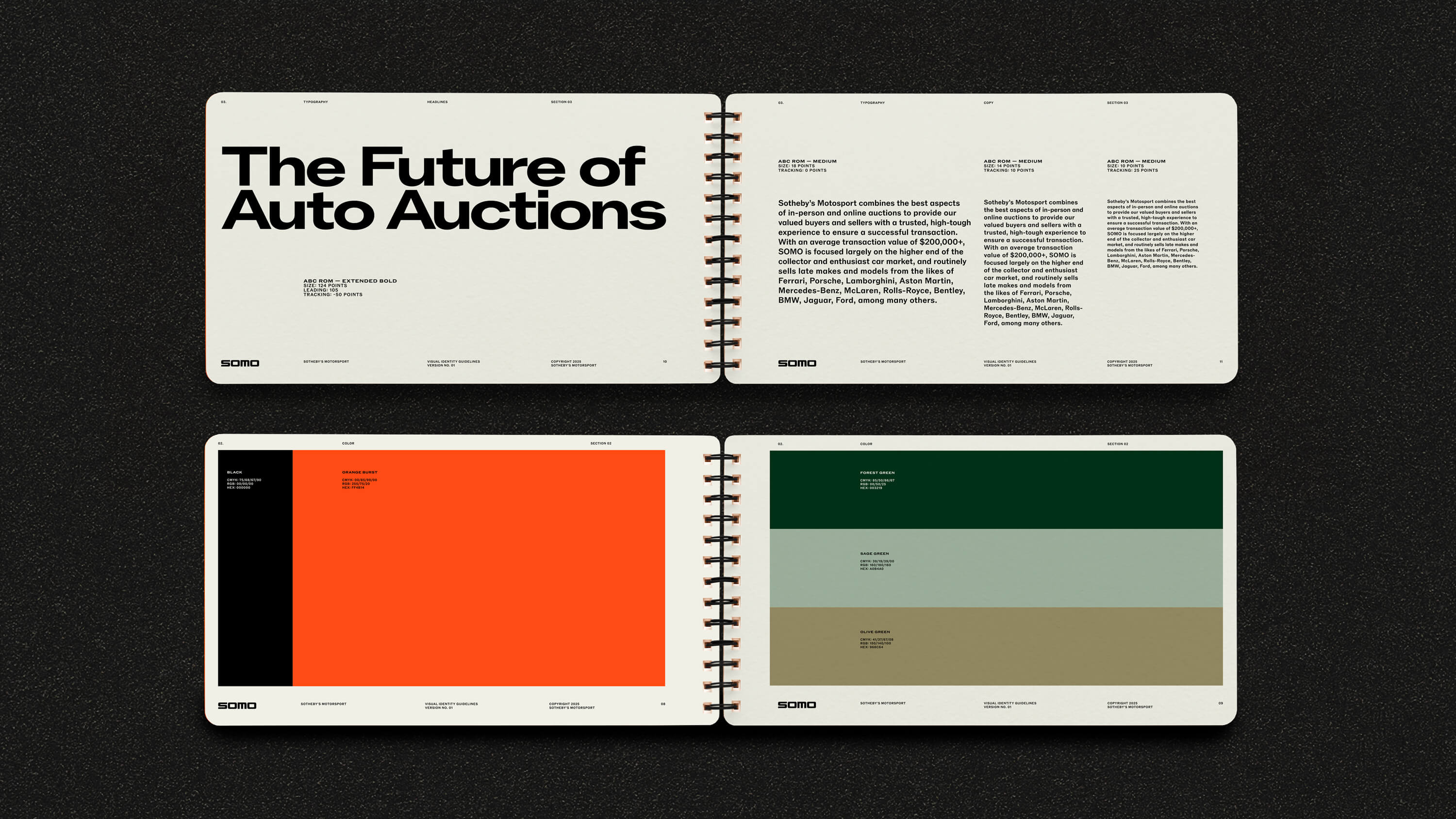
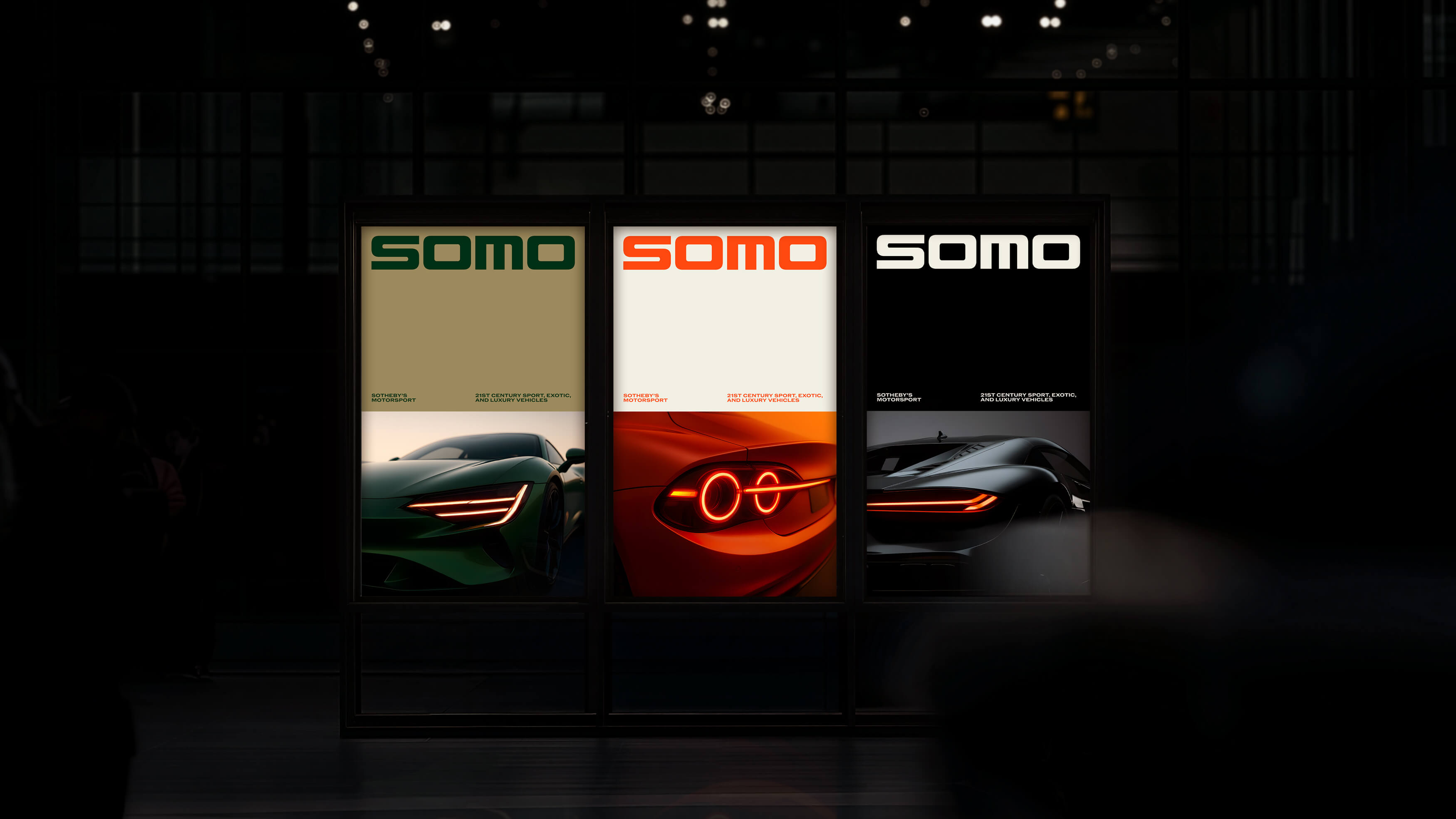
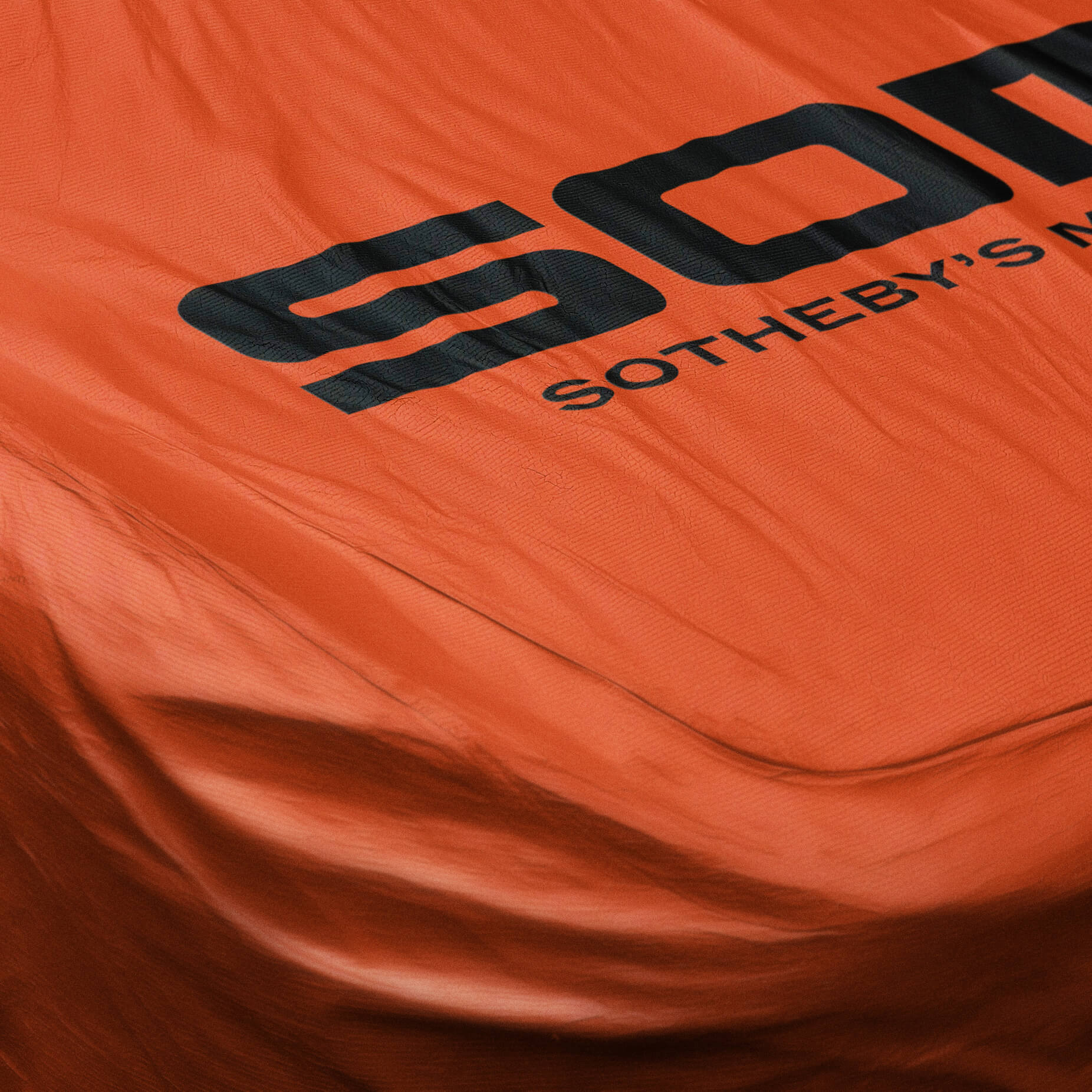
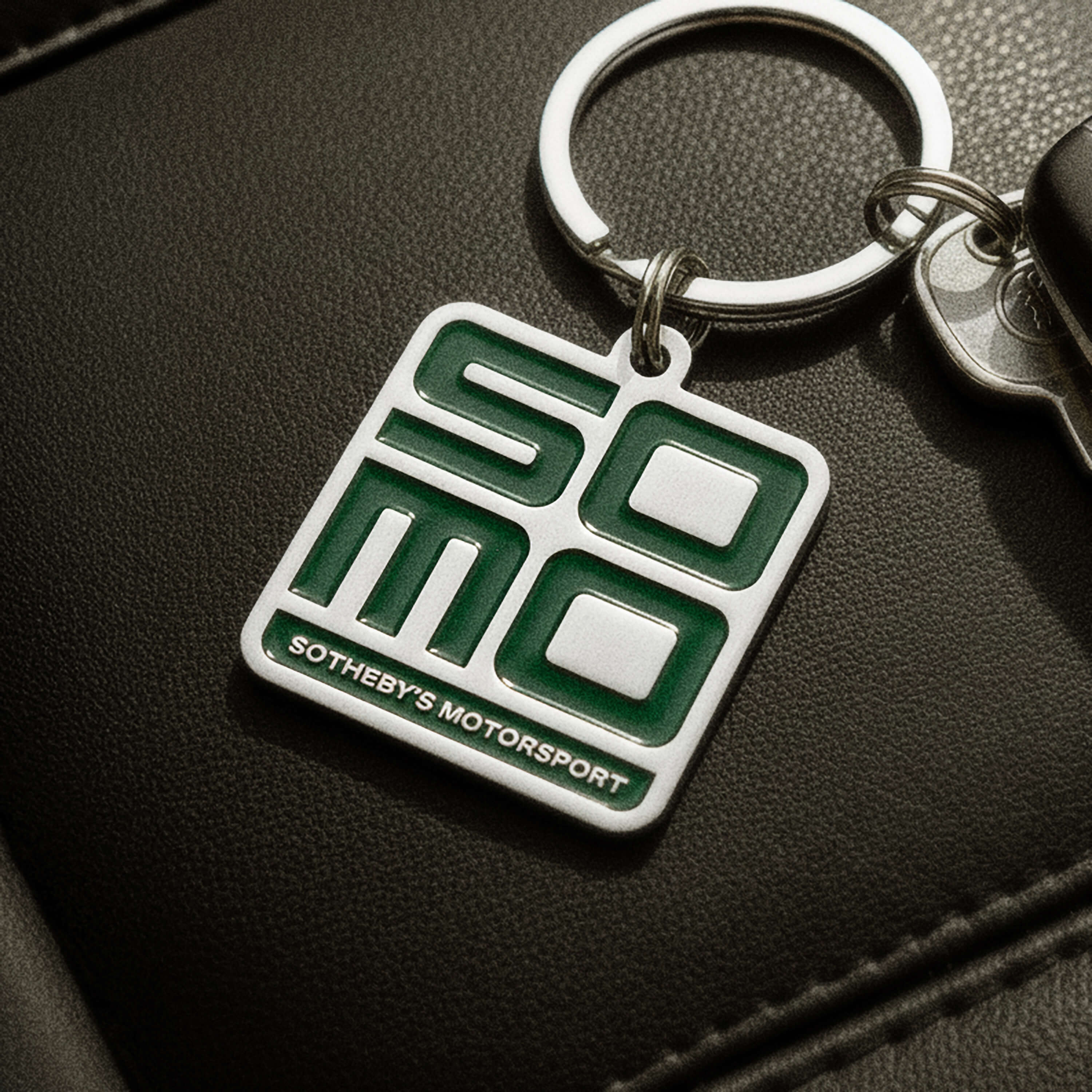
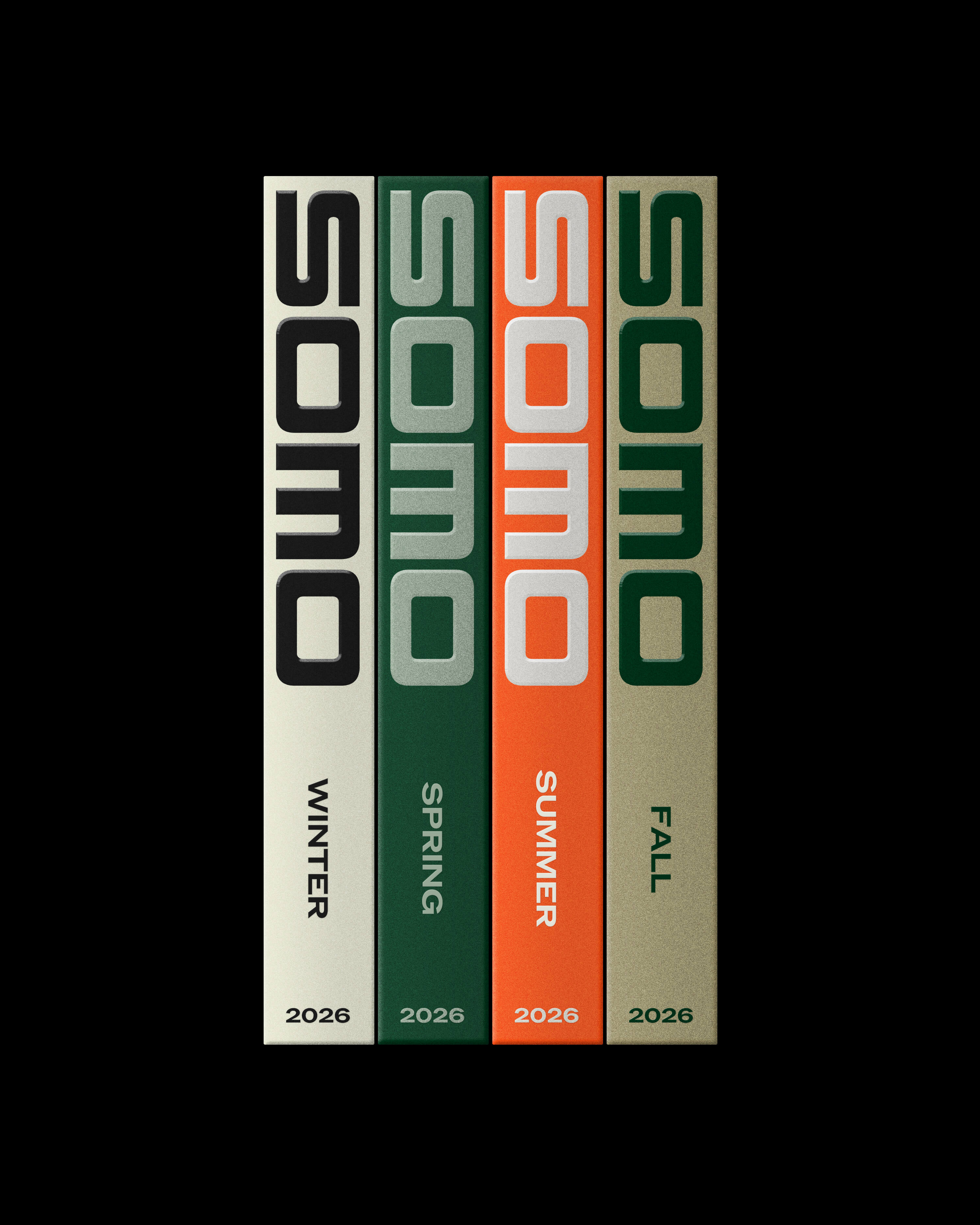
Our studio introduced a new streamlined wordmark that is low, elongated, and designed to feel sharp and fast even when static. The expanded palette adds a bold hit of orange to a foundation of racing green and gold, supported by a range of tones that allow the brand to shift its voice depending on the moment.
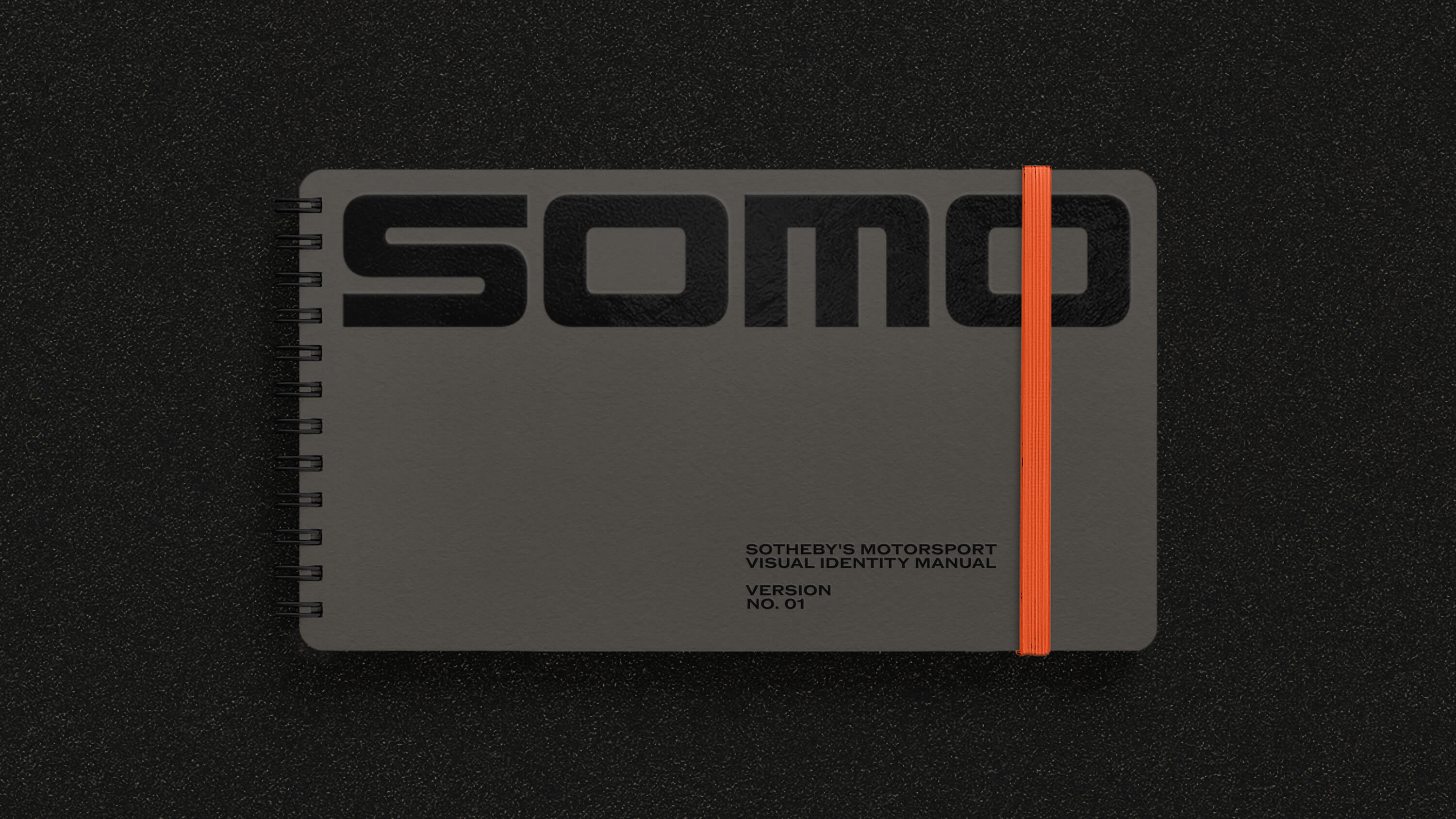
For the style guide, we selected a format inspired by retro driving manuals, offering clear and concise instruction with a functional, on-the-go sensibility.
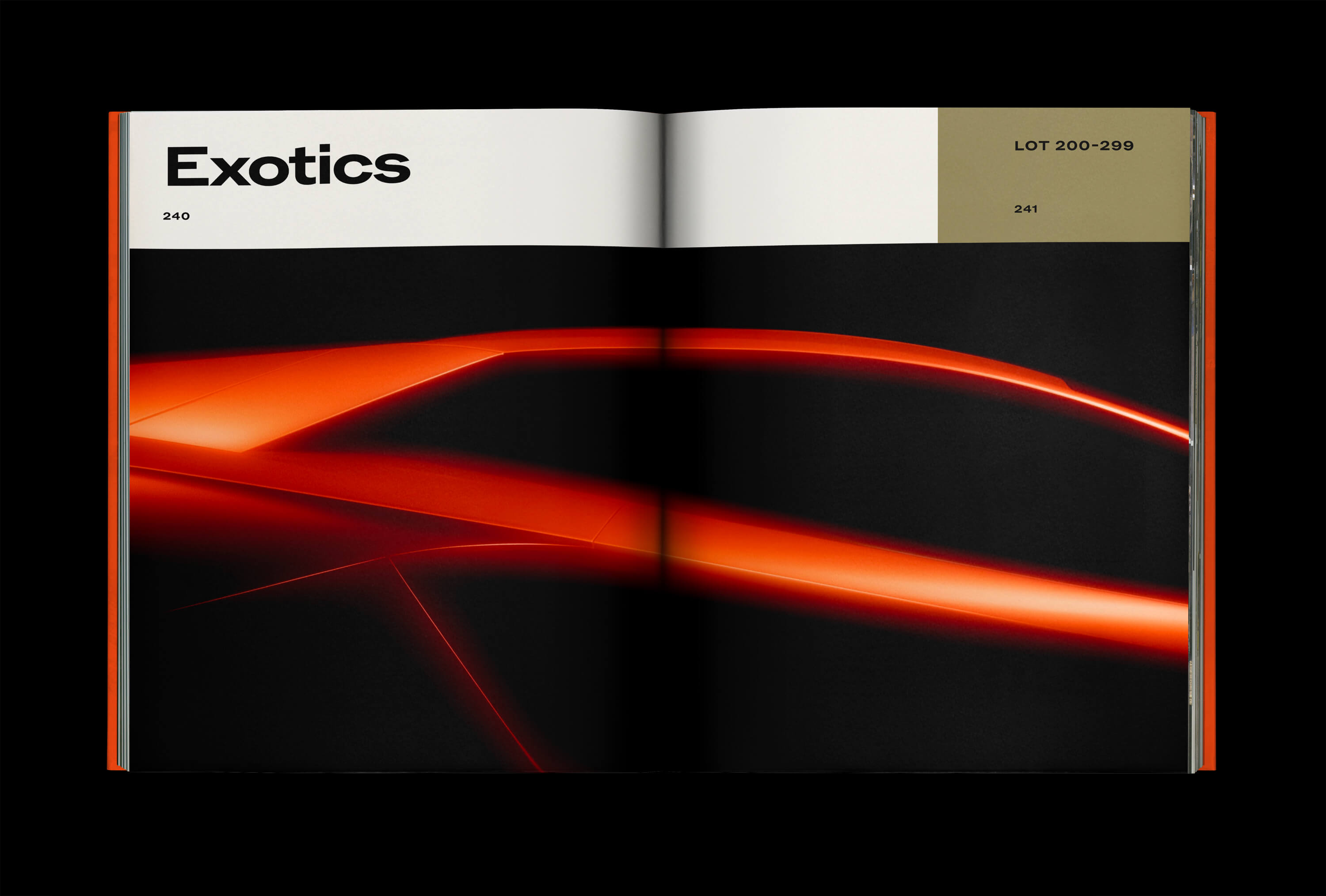
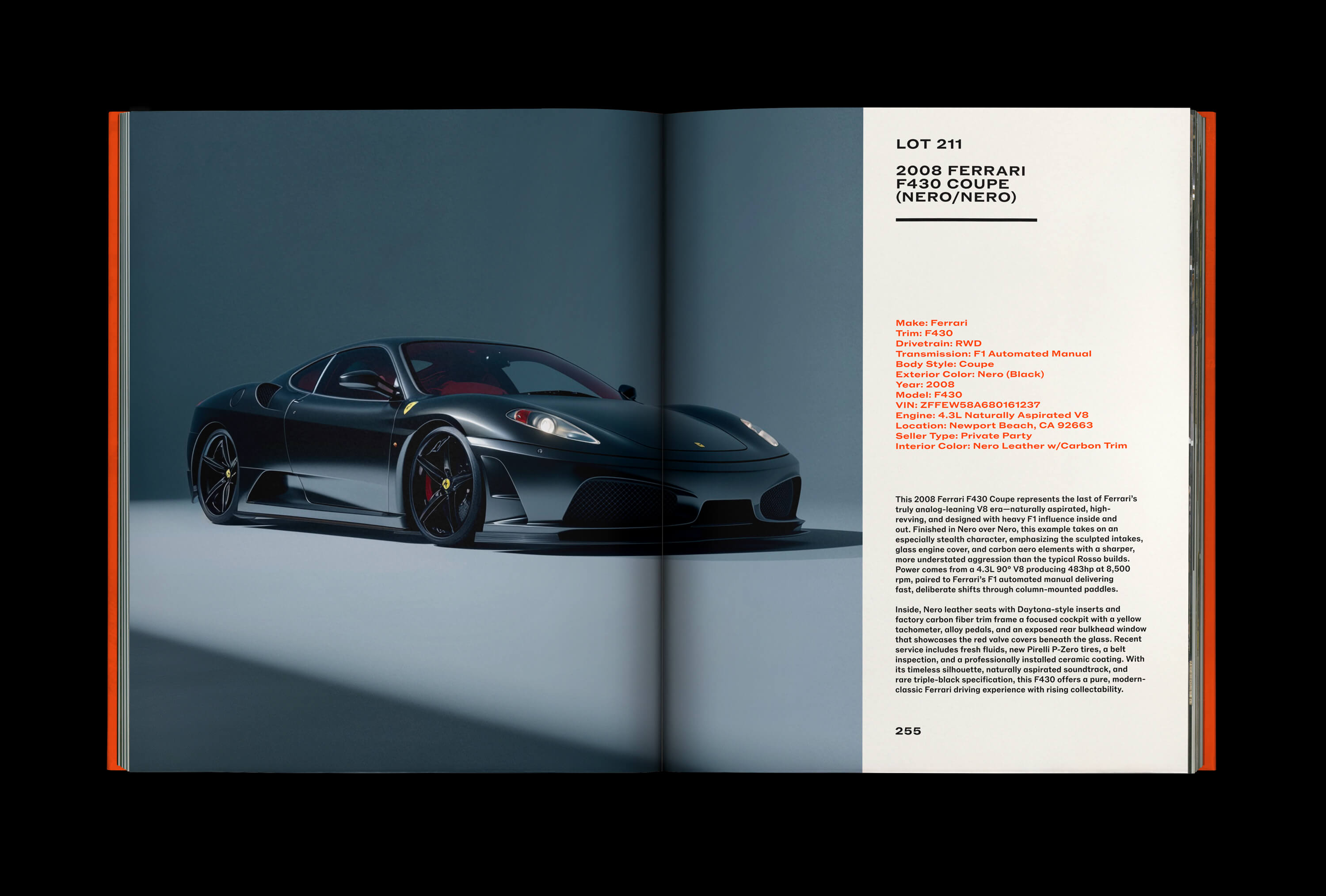
SOMO’s updated foundation extends into a flexible layout system that uses the physicality of the mark and strong blocks of color to frame logos, imagery, and key information across the brand.