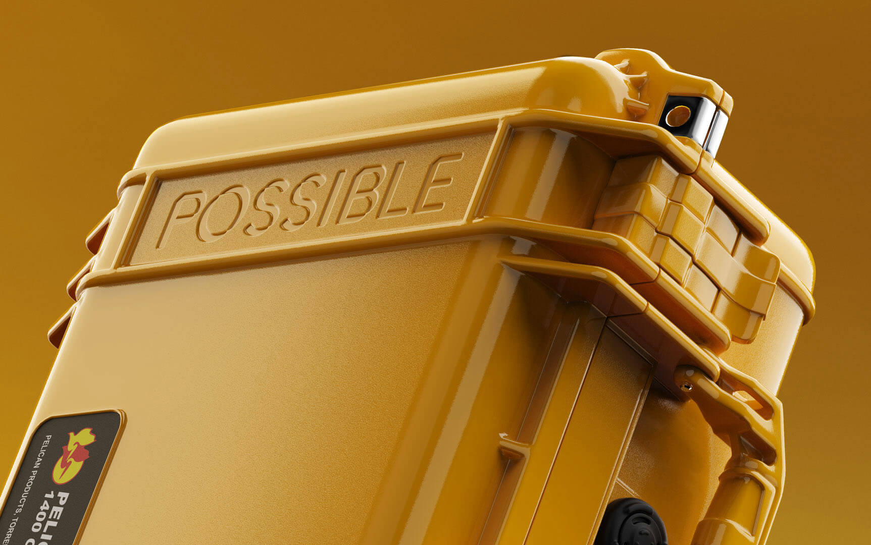
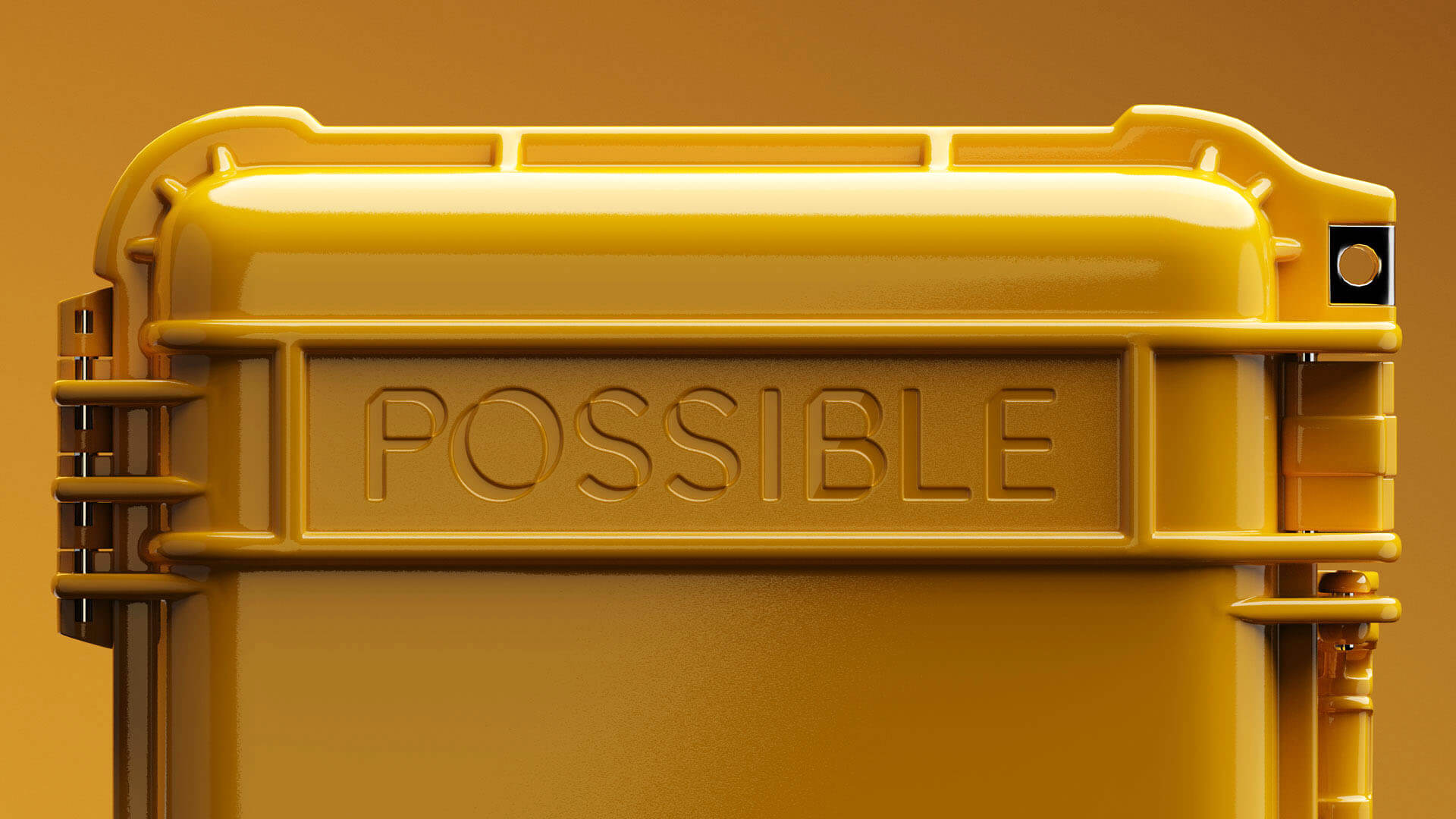
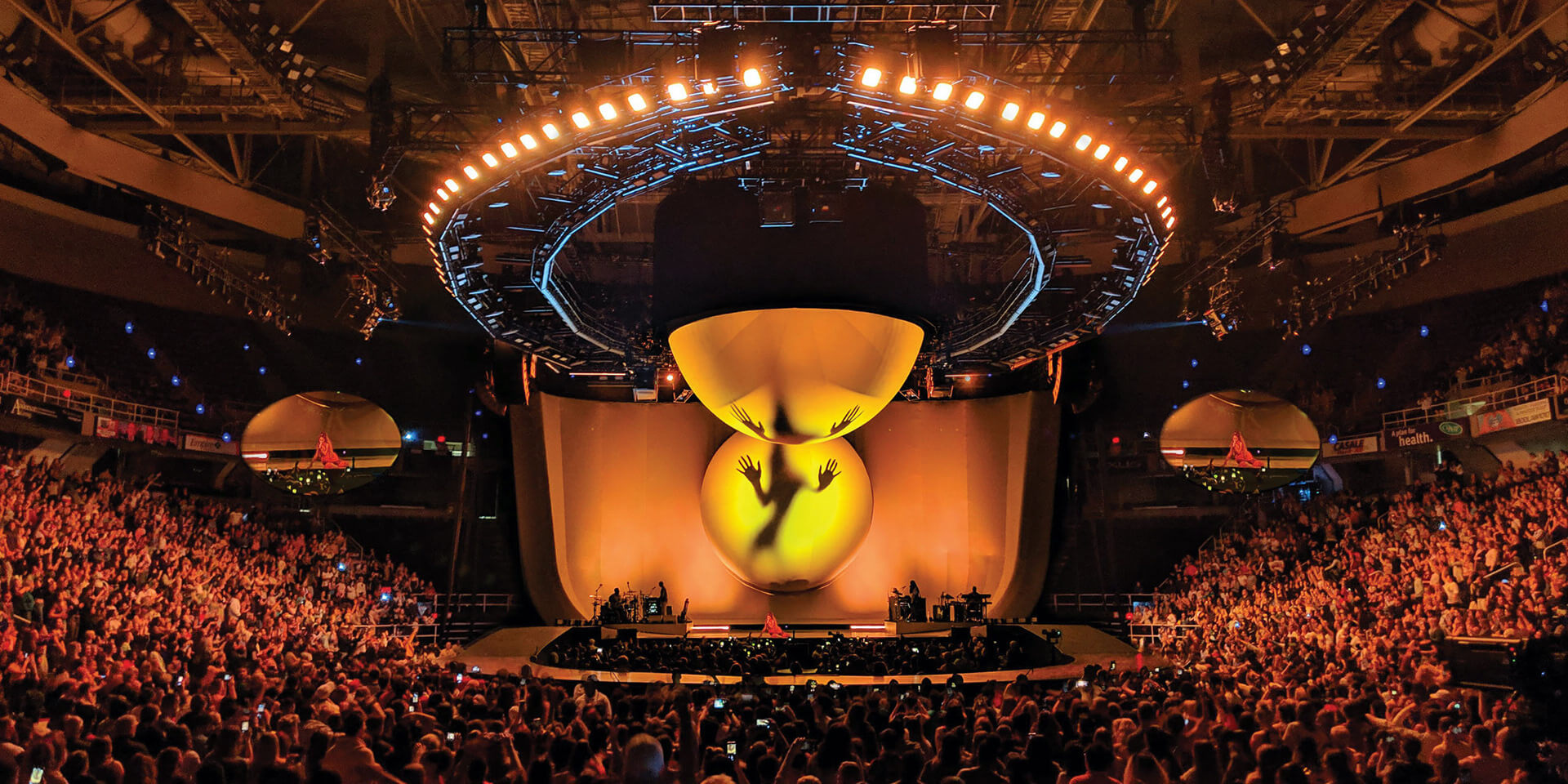
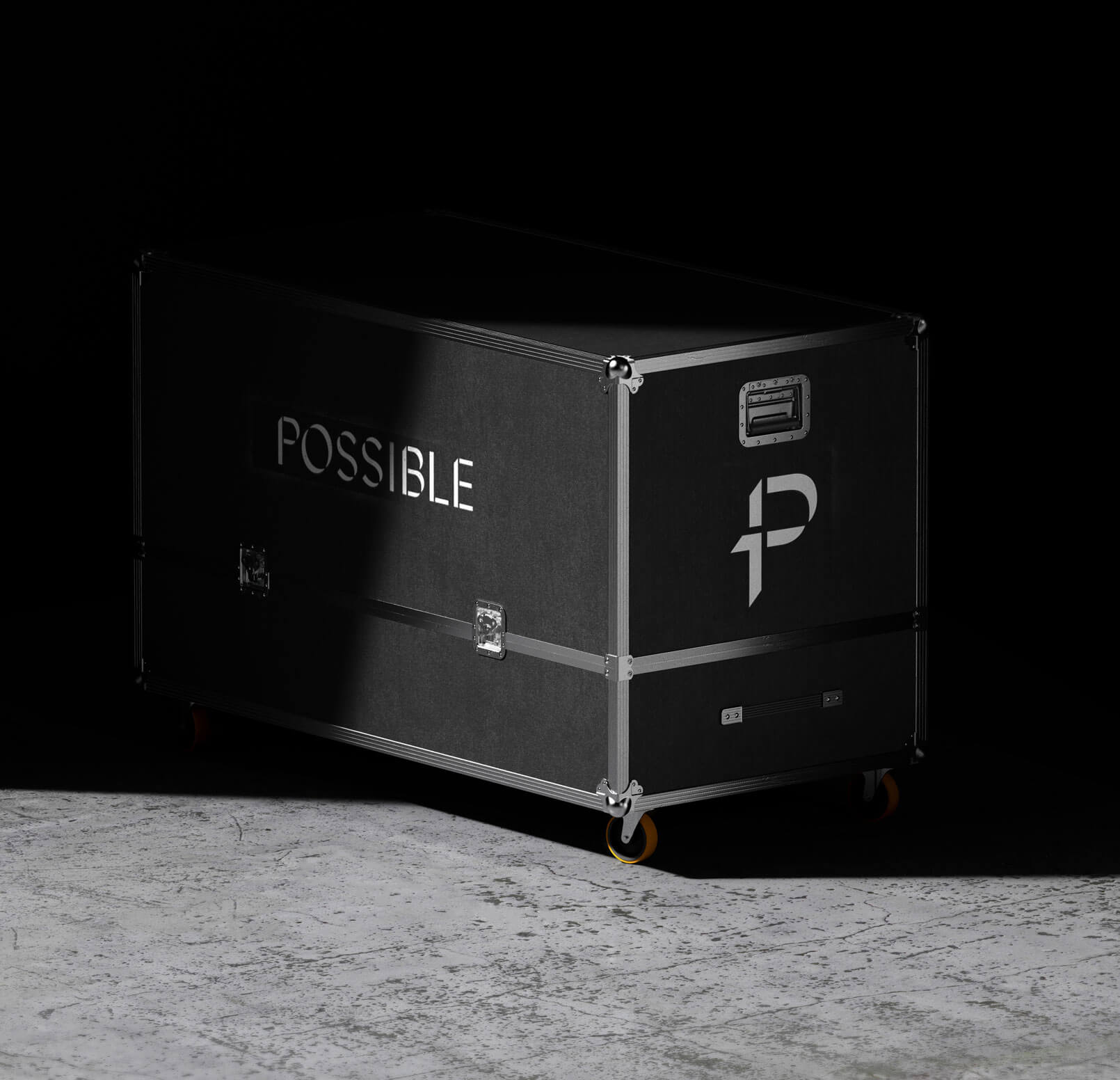
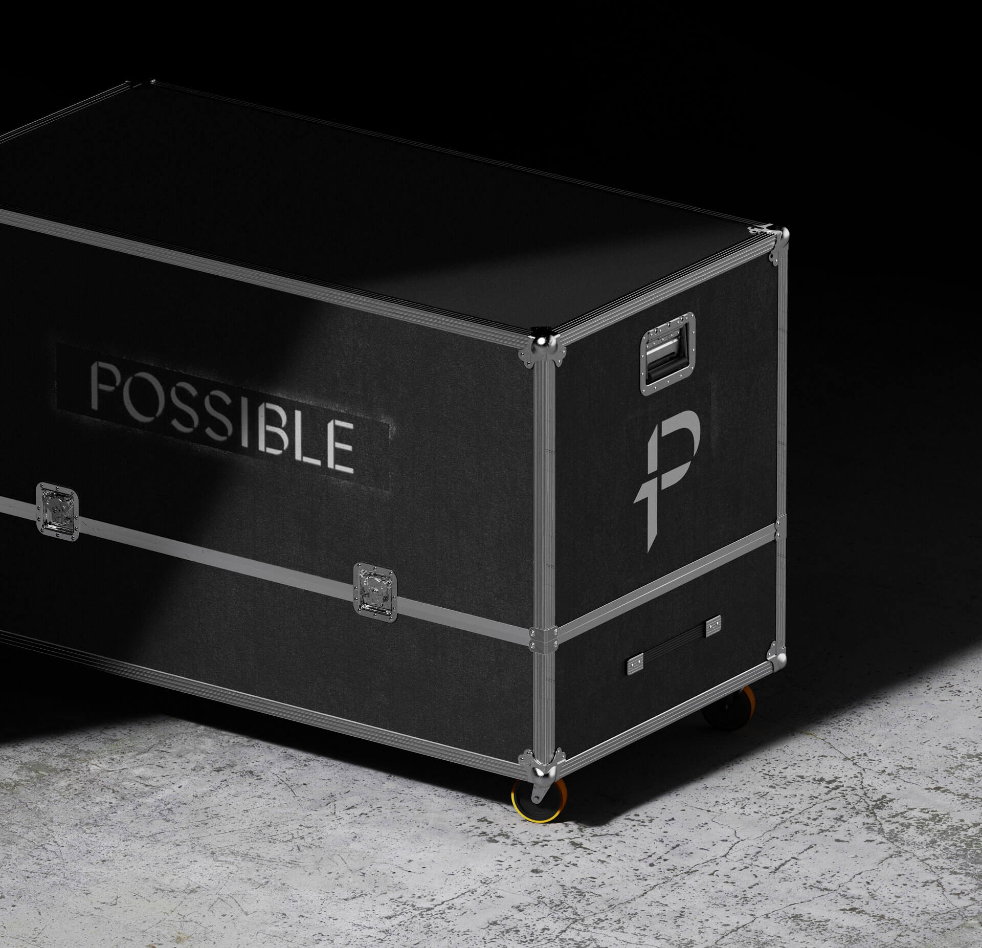
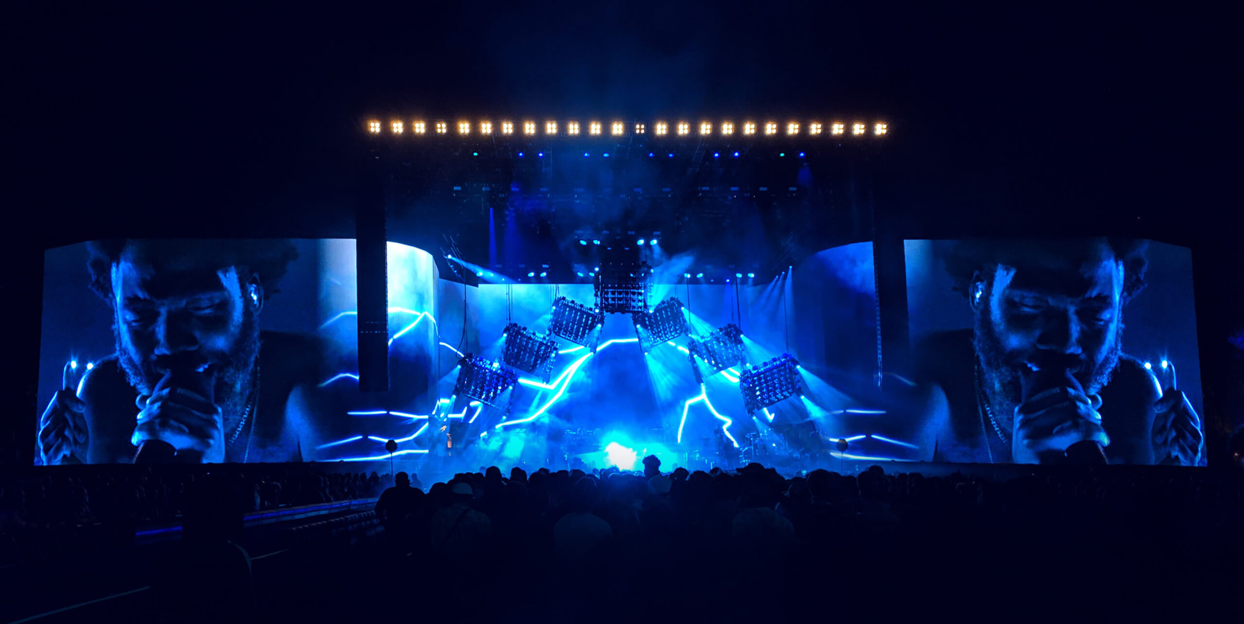
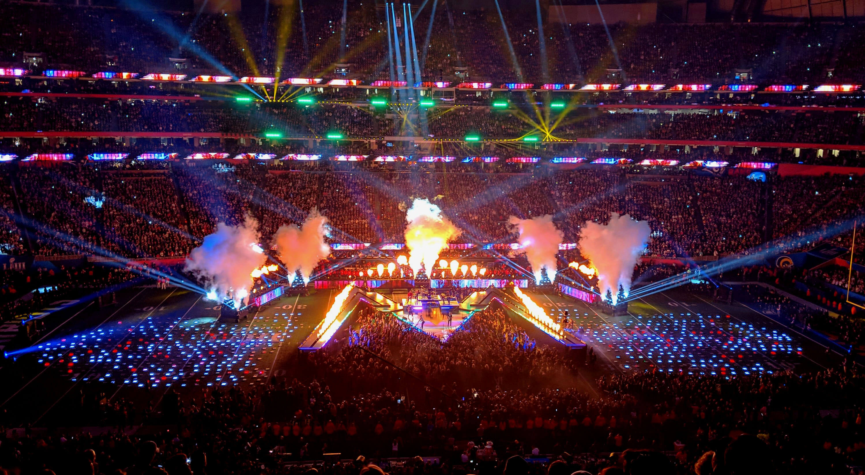
Possible is an event and live performance design consultancy that specializes in content creation for the some of the world’s biggest brands and personalities. Their industry agnostic approach has seen them work with a broad spectrum of voices, from Paul McCartney and Childish Gambino, all the way to the Super Bowl and the Democratic National Convention. We assisted in adapting the studio’s technical rigor and high-level sophistication into a new visual identity that could visually communicate on the same level as their first-class clientele.
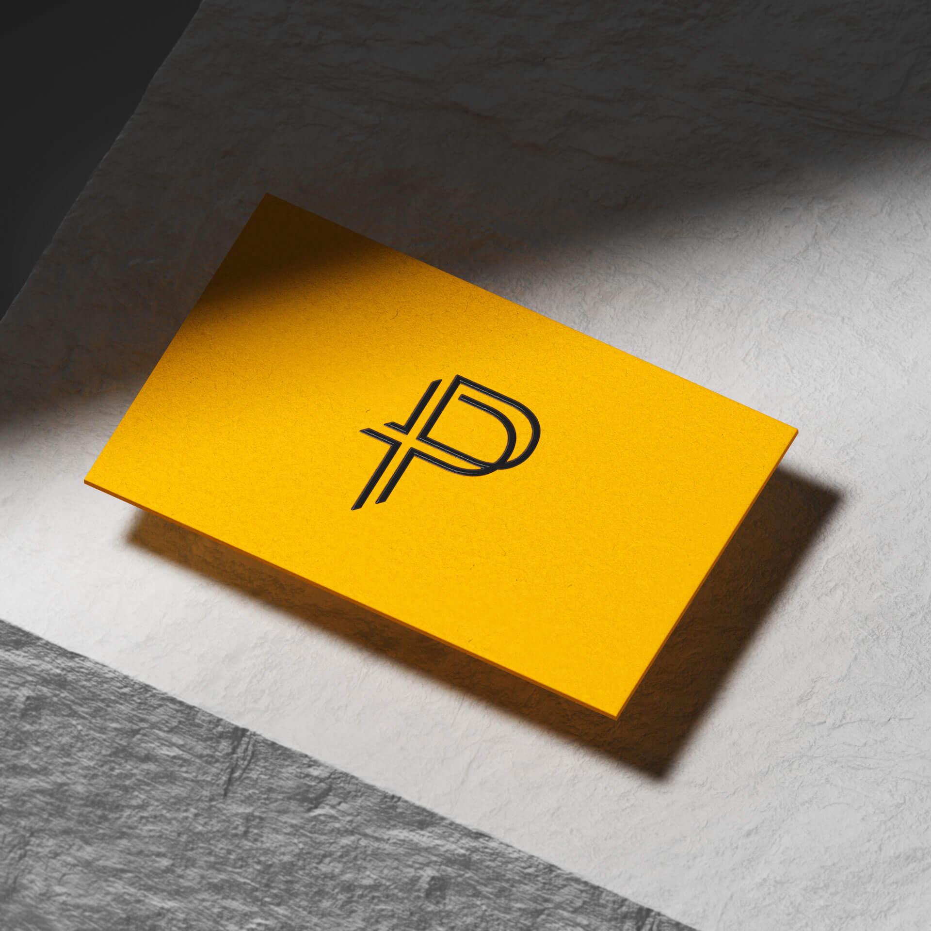
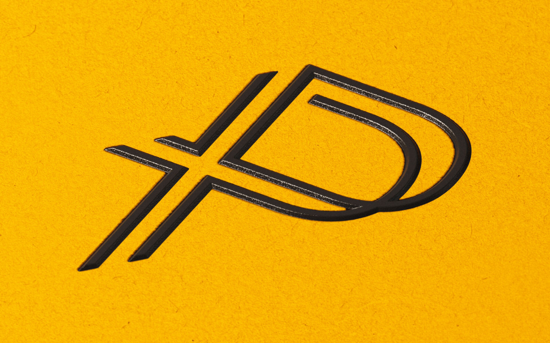
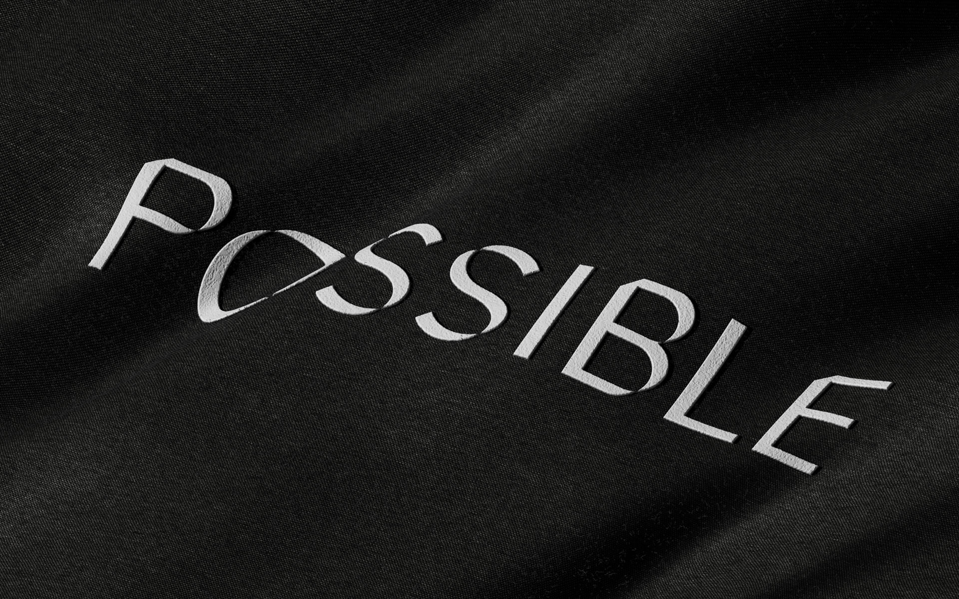
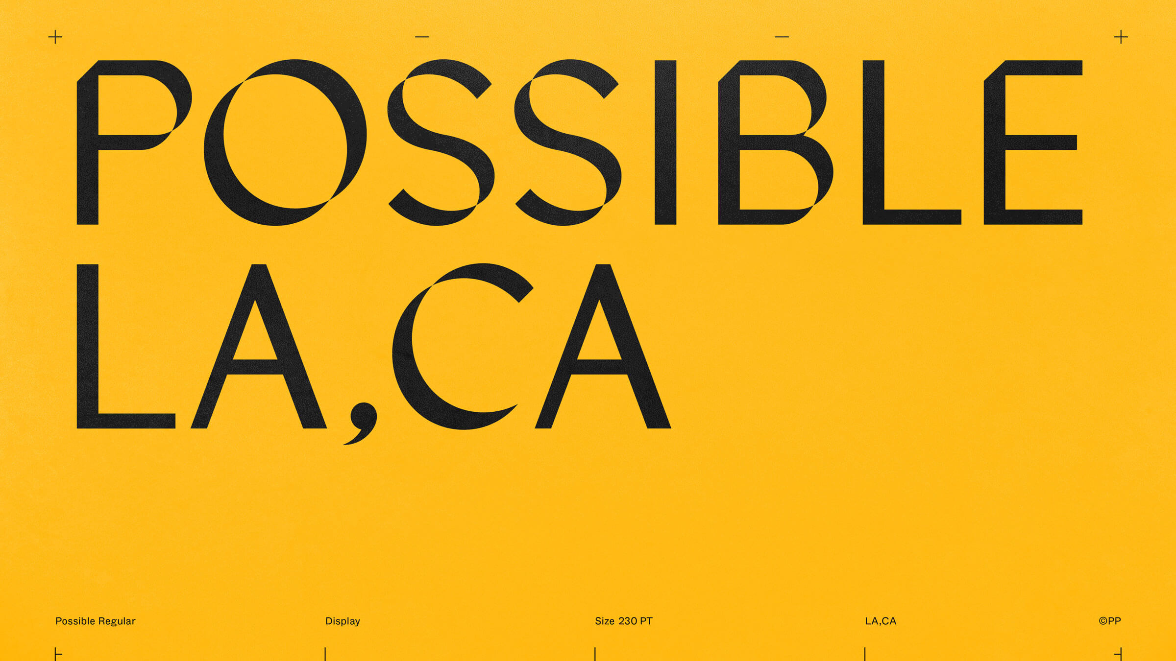
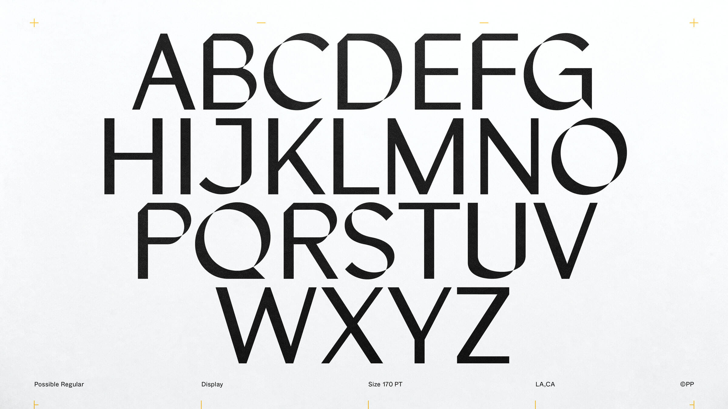
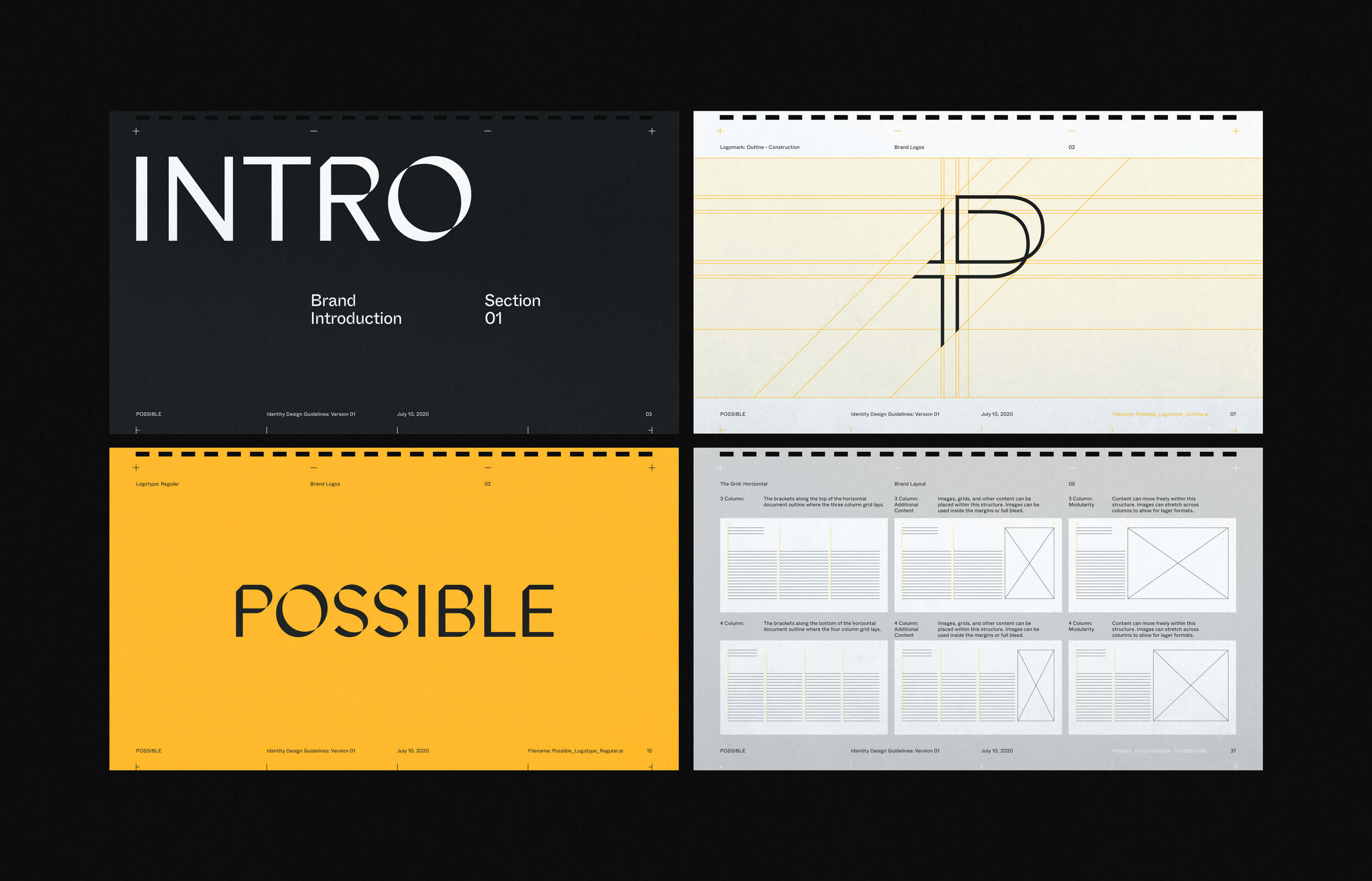
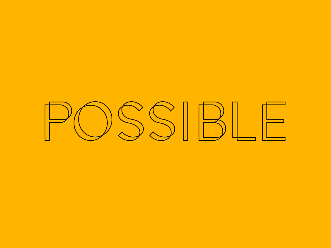
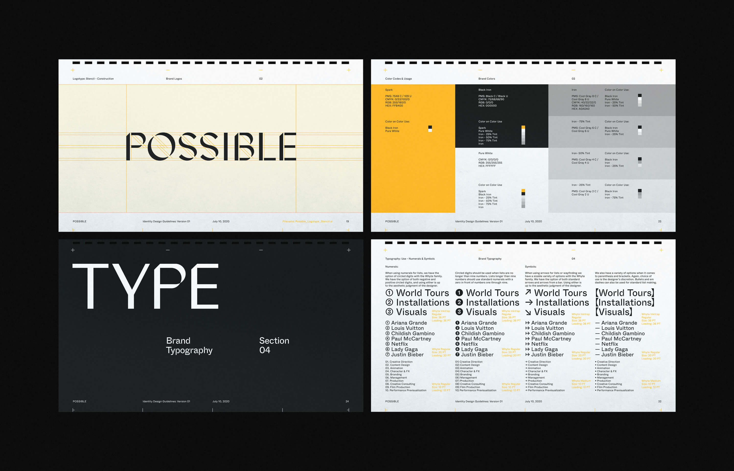
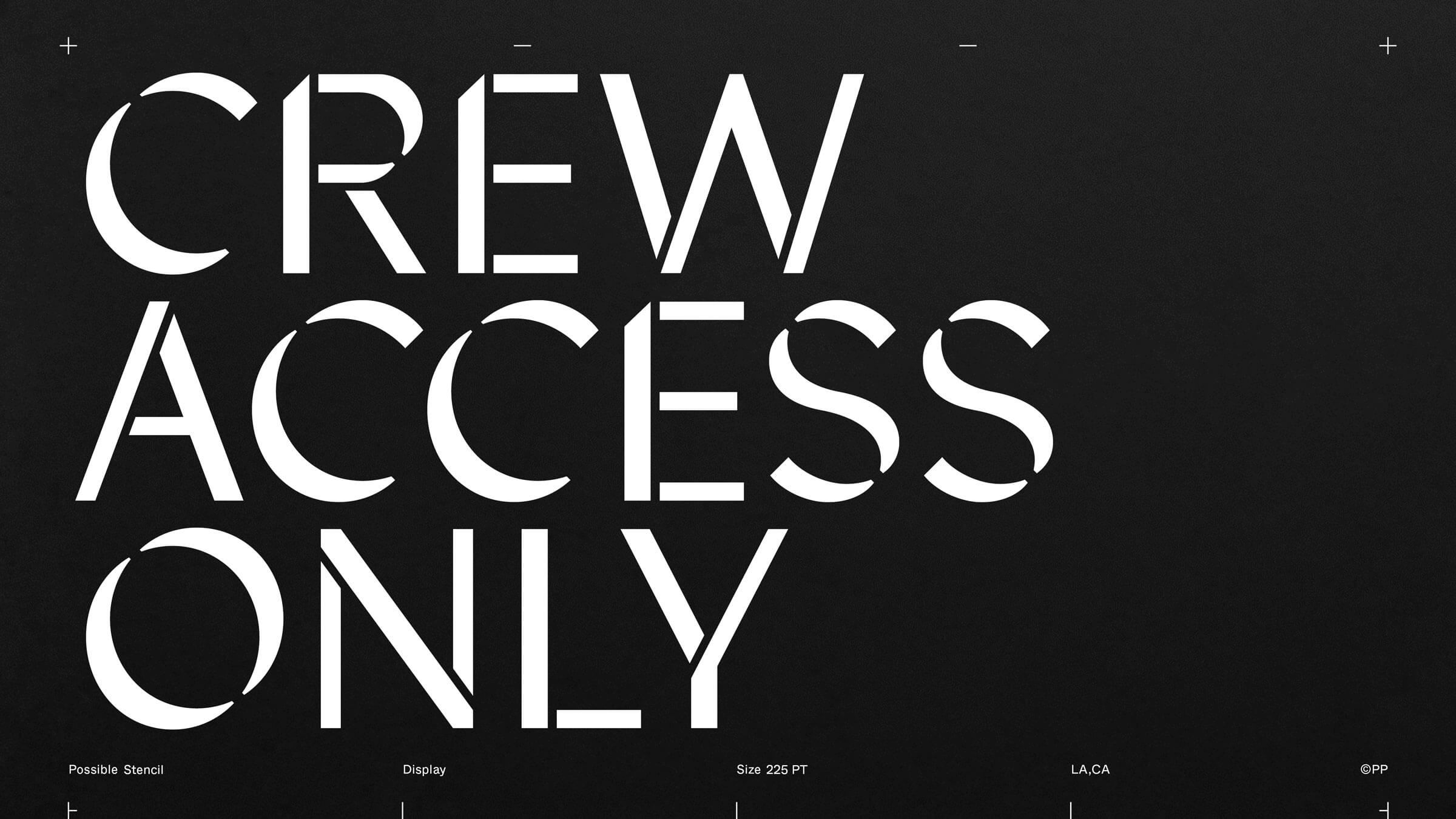
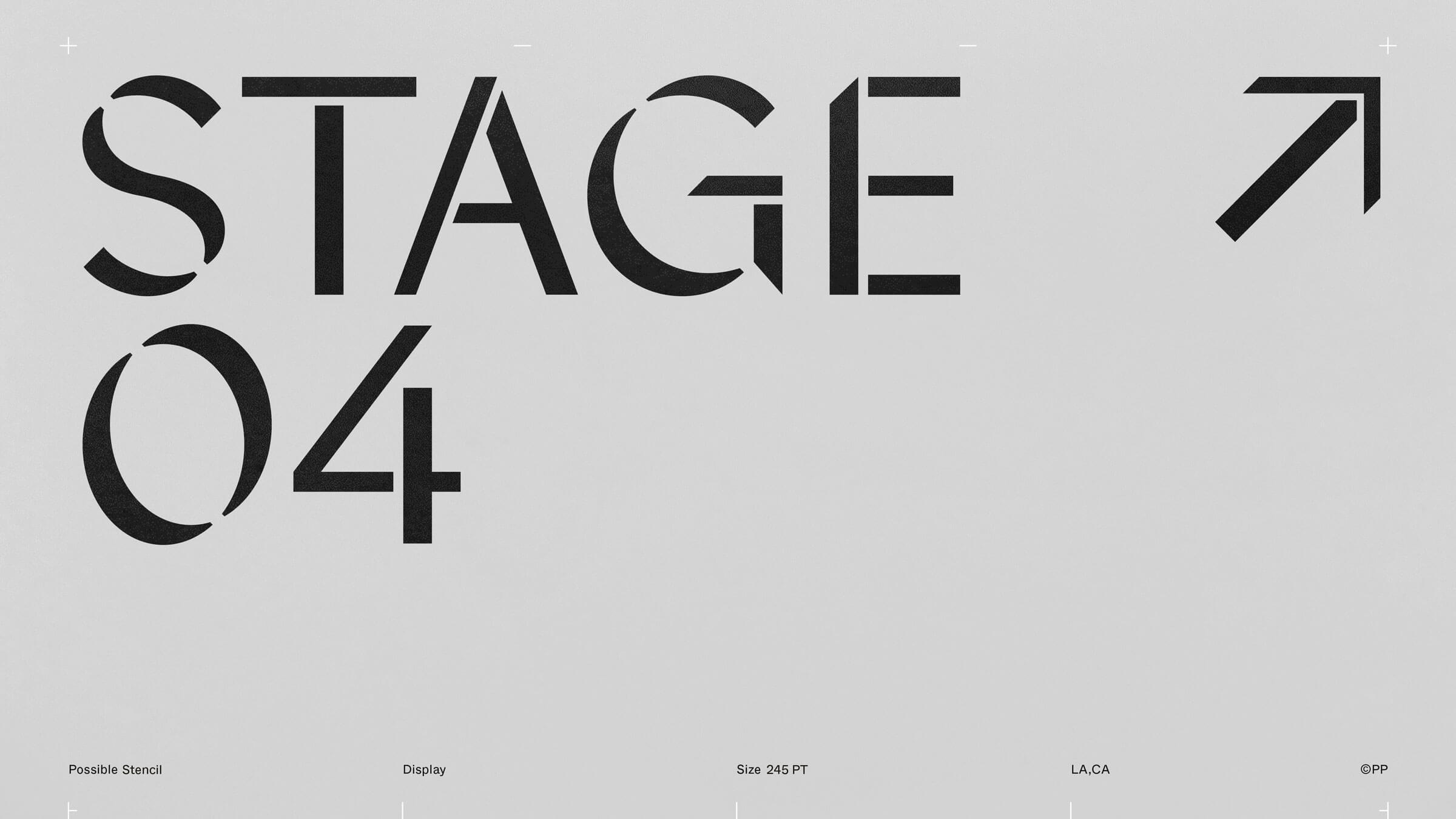
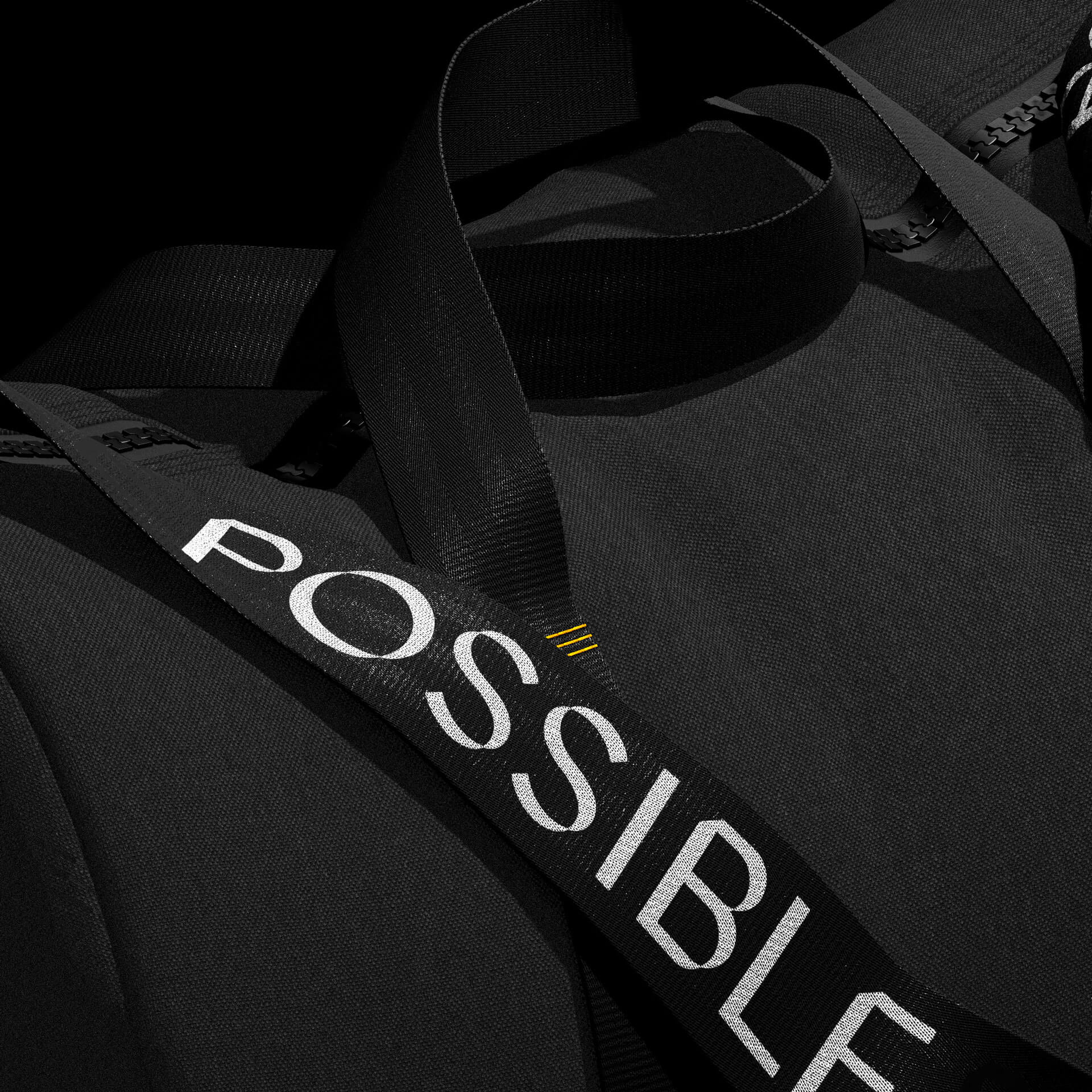
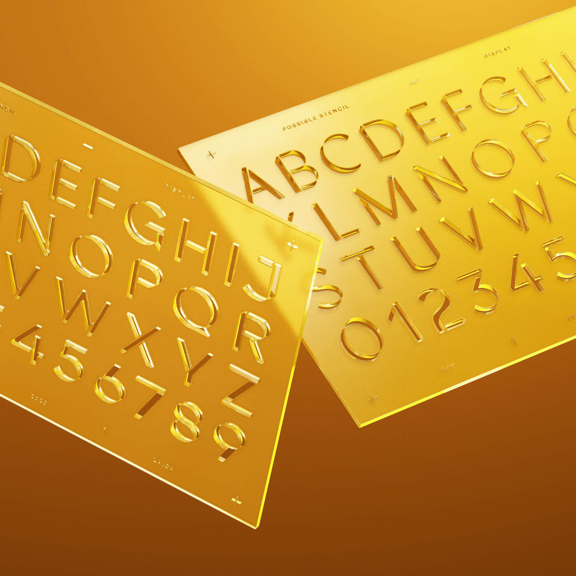
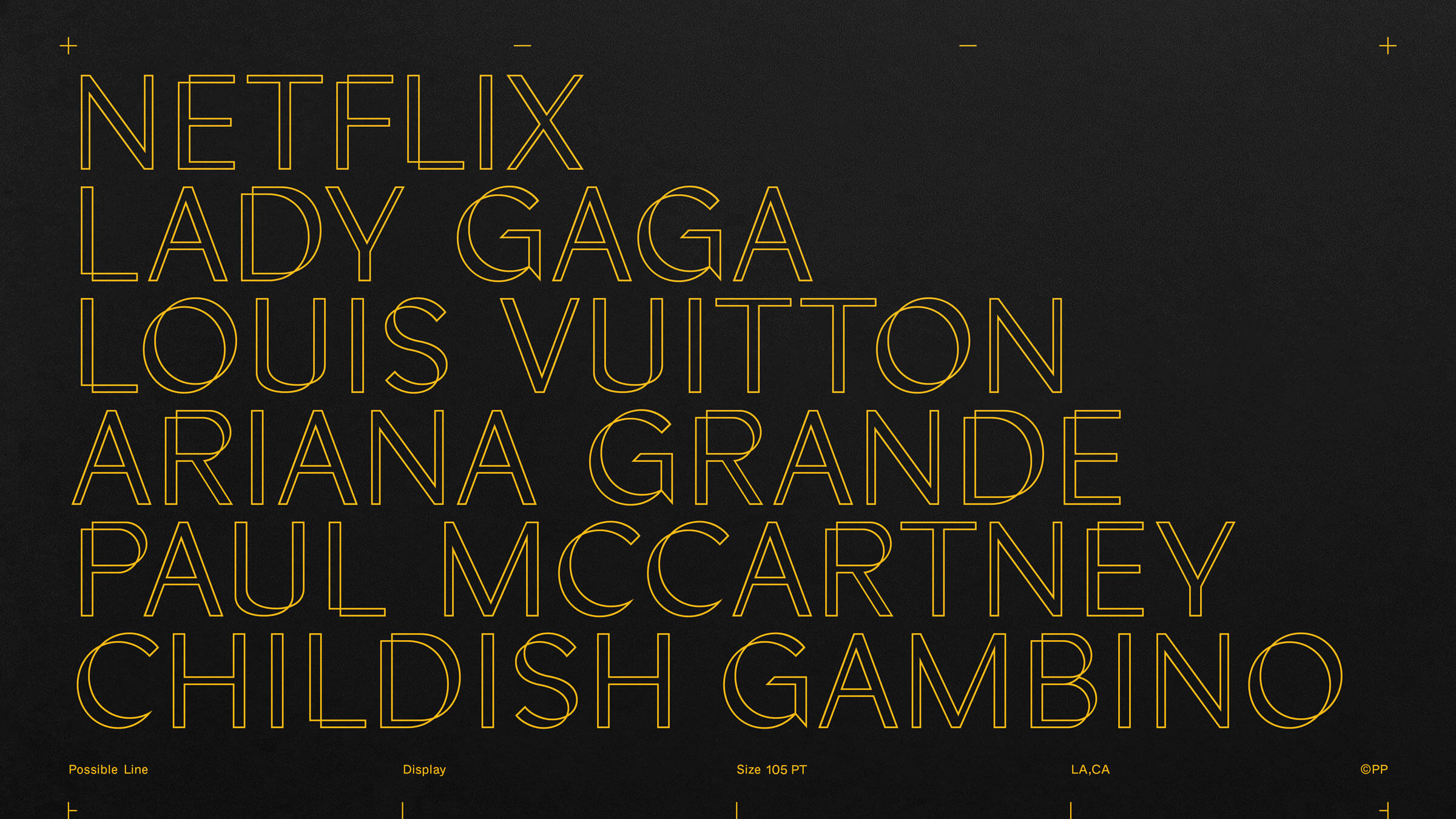
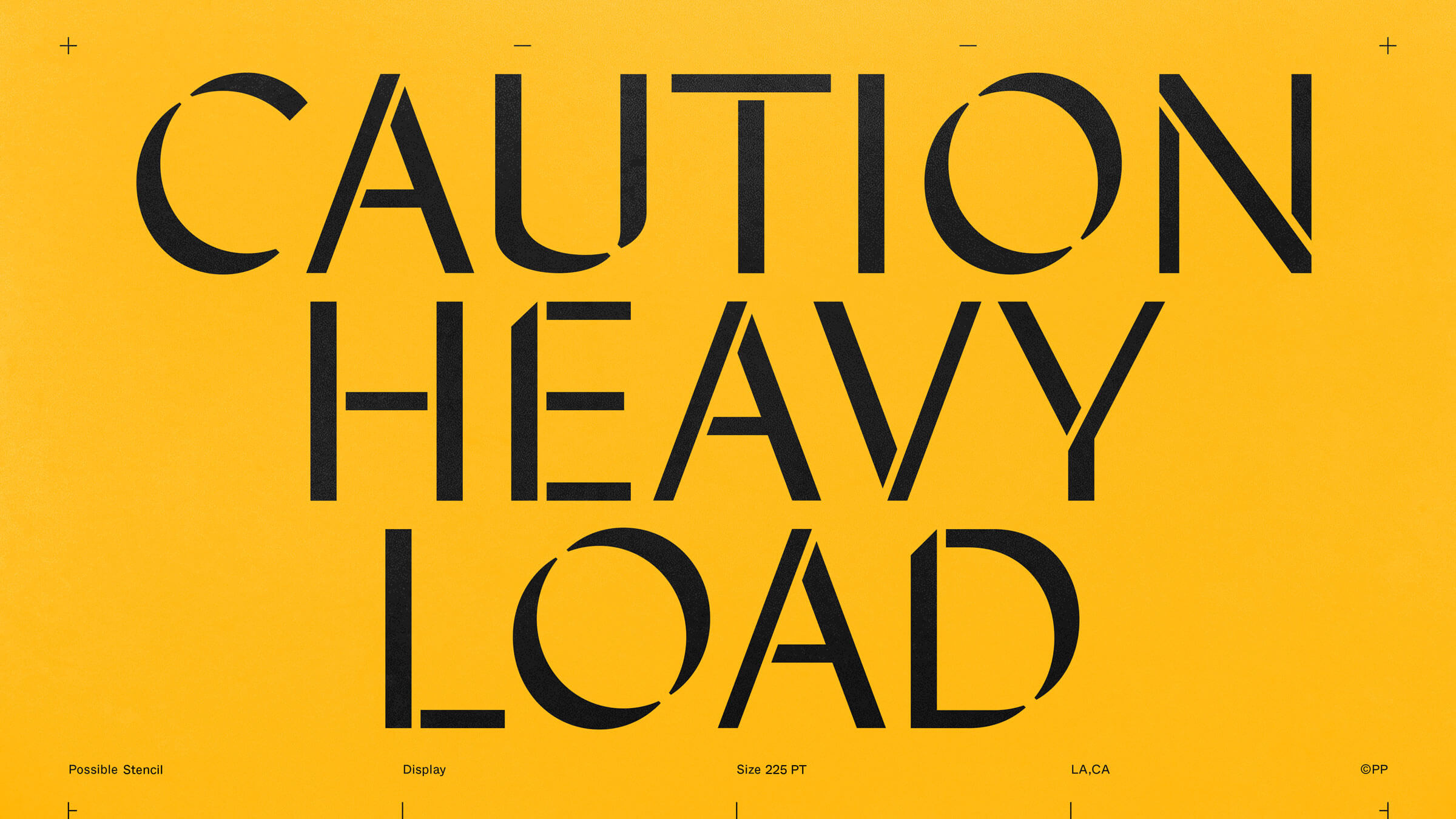
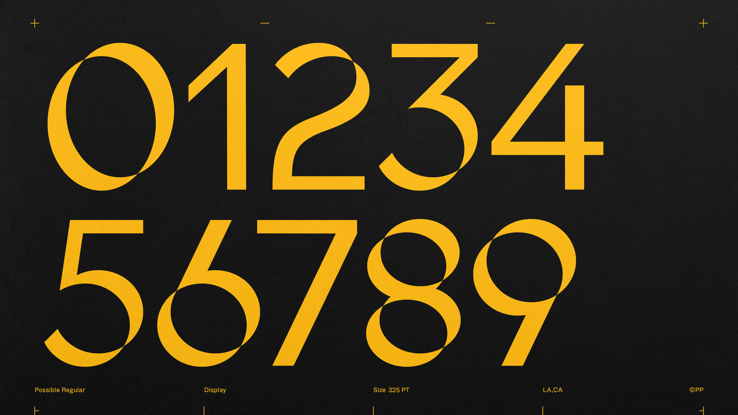
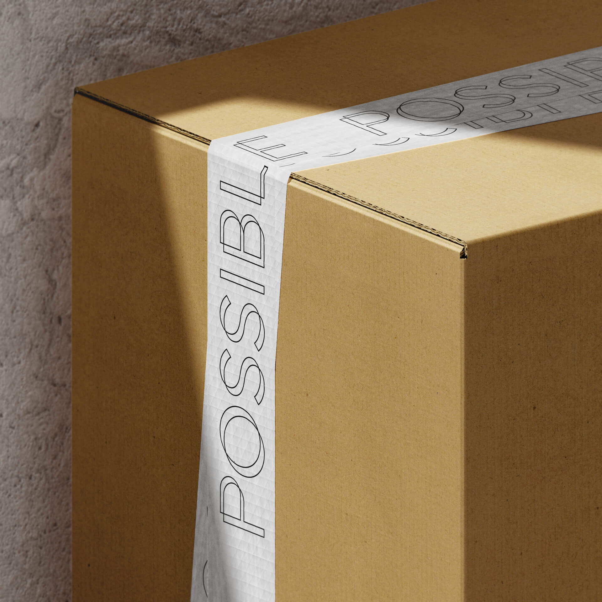
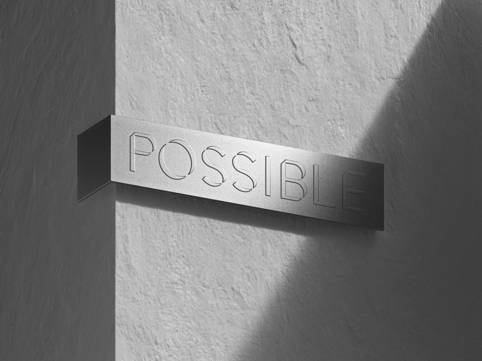
A custom typeface was designed and developed in collaboration with Tenant Studio. The new typeface consists of three styles: Line, Regular and Stencil. The concept of the characters came from the idea of translating two dimensional ideas to a three dimensional environment. This versatile family creates an elegant visual language in the lineage of script and blackletter typefaces, while also infusing an industrialized edge for streamlined use. The newly created graphic identity was then systematically implemented (in collaboration with Sample Studio) across a variety of brand collateral, studio environments, and industry level production items.